
Punchbird
Designing a Personalized Skincare Experience from Brand to Product to Pitch
Product Strategy · UX Research · Product Design · Brand Identity · E-Commerce
PROJECT OVERVIEW
Punchbird is a direct-to-consumer e-commerce startup built around a simple but underserved insight: skincare is deeply personal, but the market treats it as one-size-fits-all. The product — a personalized organic oil blend delivered to your door — is matched to each customer through a five-minute online quiz that captures skin type, lifestyle, and goals.
I was one of four co-founders, brought in as the design lead on a cross-functional founding team that included a business strategist, a marketing lead, and a product researcher. Over four months, we took Punchbird from a market hypothesis to a tested product prototype, investor pitch, and go-to-market strategy.
My scope spanned the full design surface: UX research, product design, the online quiz experience, and brand identity — while also contributing to business strategy and financial modeling as part of the founding team.


PROJECT DETAILS
Duration: 4 months
Scope: Product Designer & Strategist (1 of 4 founding team members)
My Contributions: UX research, product design, quiz UX, branding & visual identity, business strategy
Target Market: Millennials aged 22–37, organic product consumers, launching in SF and LA
Stage Reached: Live clickable quiz prototype, branded packaging, investor pitch deck
My Contributions
UX research, product design, quiz UX, branding & visual identity, business strategy
Platform
E-commerce web app (direct-to-consumer)
THE OPPORTUNITY
The global beauty industry was a $445B market as of 2019, with a clear and accelerating shift away from mass-market conglomerates toward independent, values-driven brands. Within that, the natural skincare segment was growing rapidly — driven by millennial consumers who were more ingredient-conscious, sustainability-minded, and skeptical of traditional beauty marketing than any generation before them.
The gap we identified: even as personalization became a mainstream expectation in other consumer categories (Spotify, Netflix, meal kits), skincare remained stubbornly generic. The market offered endless product choices but almost no help in choosing. Customers were left to self-diagnose, trial-and-error their way through routines, and absorb the cost of products that simply didn't work for them.
The business opportunity was a personalized, ingredient-transparent, direct-to-consumer skincare brand that made the right recommendation the first time — removing friction, building trust, and creating a sustainable subscription relationship with the customer.
Serviceable obtainable market (natural skincare, US millennials): $7.2B
THE PROBLEM
Skincare is not a solved problem for most consumers. The product landscape is fragmented, ingredient lists are opaque, and the language brands use — "for oily skin," "for sensitive skin" — collapses enormous individual variation into crude categories that don't reflect how skin actually behaves.
The result: customers spend money on products that don't work, lose confidence in their ability to find the right solution, and cycle through trial purchases that drain their budget without delivering results.
Design challenge
How might we design a personalized skincare experience that earns consumer trust, simplifies discovery, and delivers a product that genuinely works?
punchbird
RESEARCH
Research Goals
Before any product decisions were made, I led the UX research workstream to ground our strategy in real customer behavior.
What does the current skincare discovery and purchase experience actually feel like for our target users?
What signals do consumers use to decide whether a product is right for them?
What does "trust" mean in the context of a skincare brand — and how is it earned?
User Research
We conducted 50+ quantitative survey responses to map broad attitudes and behaviors, followed by qualitative one-on-one interviews with participants who matched our target profile: millennials who actively seek out organic or natural products and have an established skincare routine.
Key findings
The discovery experience is exhausting. Participants described spending hours reading reviews and watching YouTube tutorials, yet still feeling uncertain. The volume of available information was making decisions harder, not easier.
Ingredient transparency is a purchase trigger. Participants who identified as ingredient-conscious described feeling actively misled by brands that buried or obscured what was in their products. Clear, plain-language ingredient explanations were a strong trust signal.
Trust has three dimensions. Research consistently pointed to three values driving purchase decisions in this category: trust (knowing what's in it and that it works), wellness (products that support health, not just appearance), and ethics (sustainable sourcing, supply chain transparency). These became the three brand pillars we designed around.
Customization is appealing but unfamiliar. Most participants had never purchased a custom-formulated product. The concept generated genuine interest, but also uncertainty — how the product would be made for them and whether the algorithm could really know their skin better than they did — were recurring concerns. This had direct implications for how we designed the quiz.
Routine friction is real. Participants who had tried to build a skincare routine often cited complexity as the reason they'd abandoned it. The more steps, the more products, the harder it was to maintain.
Secondary Research & Trend Analysis
Secondary research confirmed that the macro trends were aligned with our positioning. The beauty industry was moving toward natural ingredients, transparent supply chains, flexible subscription models, and online-first discovery — all areas where Punchbird had a structural advantage over legacy brands.
We identified five direct competitors — including Curology, Prose, and Function of Beauty — and mapped them against axes of naturalness and personalization. The white space was clear: no brand combined deep personalization with fully natural, oil-based formulations and ethical sourcing at accessible price points.

There is an opportunity for us to be both informative and transparent with our product offering.

We identified top five competitors based on their overall strengths and weaknesses, and how they compare to our projected business.
Emerging trends in the beauty industry

100% natural ingredients
Transparent supply chain
Flexible subscription plan
Discount with subscription
Online quiz
Customized products
DEFINING THE CUSTOMER
Based on the quantitative and qualitative research, we developed a segmentation framework that divided the addressable market into two primary groups: Aphrodite (results-oriented, beauty-first) and Nymph (holistic, ingredient-first). Within the Nymph segment, we identified two sub-personas: DIY Daisy (self-formulates, high ingredient knowledge, low willingness to pay for convenience) and Pampered Paloma (values natural ingredients but wants the work done for her).
We focused the MVP on Pampered Paloma — the persona with the highest conversion potential and the strongest product-market fit for a ready-to-use, customized formulation.
Pampered Paloma
Ages 22–37, income above city average
Shops at Whole Foods, Sephora, and Amazon
Discovers products through Instagram and peer recommendations
Spends $15–$60 on skincare oils
Desires: personalization, visible effectiveness, an enjoyable routine
Frustrations: greasy formulas, products that don't deliver on their claims

Basic user:
Knowledgeable about the benefits of natural products and certain ingredients
Ages 22–37
Shops at WholeFoods, Amazon, and Sephora
Spends between $15–$60 on oils
Learns about new products through friends and social media, such as Instagram ads
Desires:
personalization
obvious effectiveness
enjoyable regime
Frustrations:
greasiness
formulas not working
This persona directly shaped every product and design decision that followed — from the tone of the quiz to the packaging experience to the subscription pricing model.
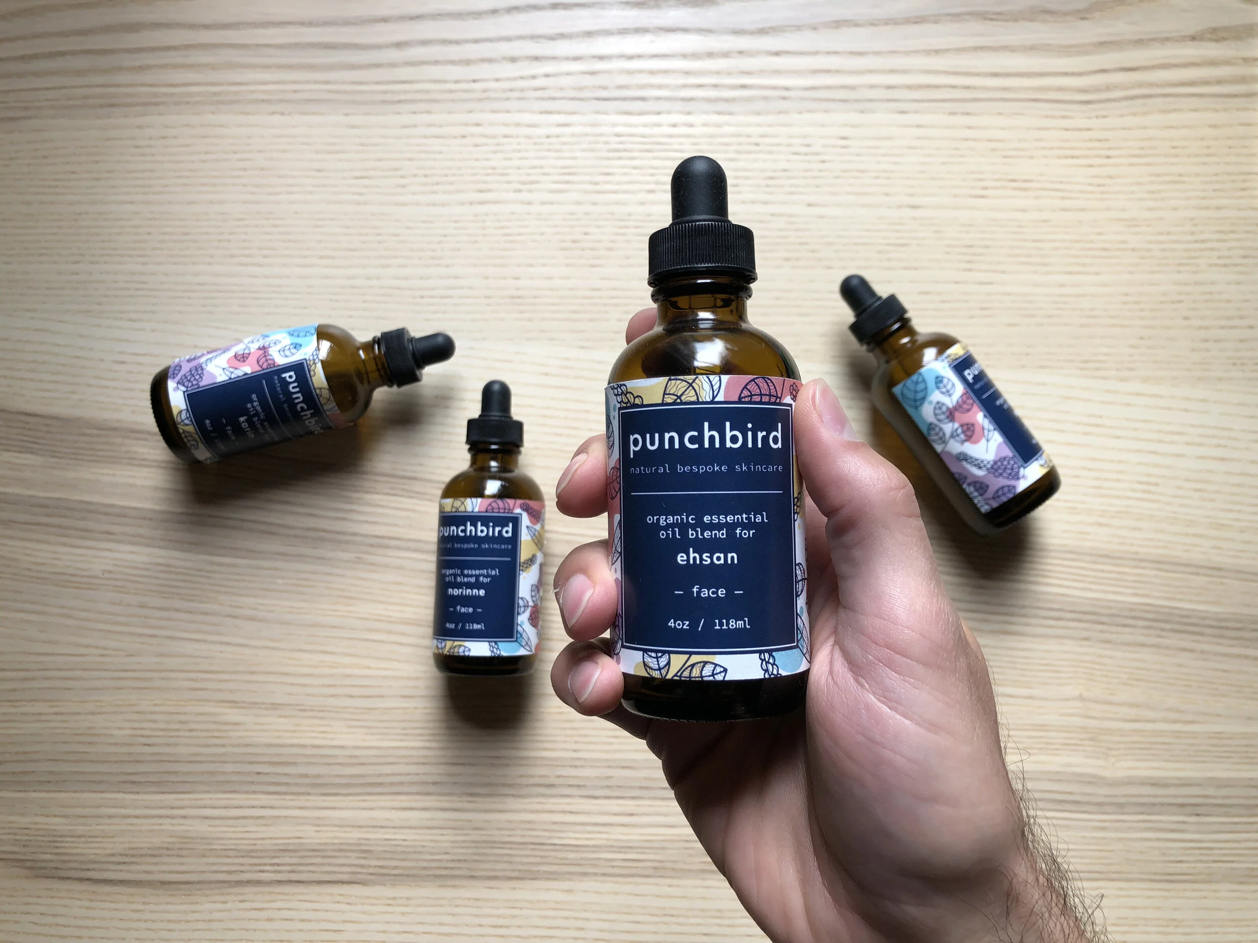
BRAND IDENTITY
I developed the Punchbird visual identity from the ground up, establishing the brand's design language across digital and physical touchpoints.
Strategic direction: The name "Punchbird" signaled energy and distinctiveness — we didn't want to look like another soft, botanical, millennial-pink wellness brand. The visual identity needed to feel confident, ingredient-forward, and premium without being exclusionary.
Color palette: Deep earthy tones anchored in natural ingredients, with clean white and a sharp accent to signal precision and clarity
Typography: A confident display typeface for brand moments, paired with a highly legible body font for ingredient and product information
Photography direction: Natural light, tactile materials, real skin — no retouching, no perfection, no aspirational distance
Tone of voice: Educated but accessible; direct and ingredient-honest; never preachy
The brand identity was applied across the website, quiz interface, packaging, and pitch materials.
PRODUCT DESIGN
The Core Product: Personalized Oil Blend
The physical product — a proprietary blend of carrier and essential oils matched to the customer's skin profile — was itself a design problem. The type and proportion of oils in each blend needed to be determined by a decision tree algorithm fed by quiz responses. I worked closely with our research lead to understand the ingredient space, then designed the quiz logic to capture the right inputs without making the customer feel like they were completing a medical intake form.
Designing the Quiz Experience
The quiz was the most critical design surface in the entire product. It was simultaneously our primary conversion mechanism, our data-collection tool, and the moment when a customer decided whether to trust us. Getting it wrong on any of those dimensions would break the business model.
Design principles I established for the quiz
Progressive disclosure over front-loaded complexity. Asking too many questions at once would cause a drop-off. I structured the quiz in short thematic sections — skin type, lifestyle, goals, sensitivities — with clear progress indicators so users always knew how far they had to go.
Questions that feel like a conversation, not a form. The language was written to feel like talking to a knowledgeable friend, not like filling out a medical intake form. Every question was paired with a plain-language explanation of why we were asking — reinforcing transparency as a brand value.
Visual answer options where possible. For questions about skin behavior (e.g., how skin feels after washing), I used visual reference cards rather than text-only options to reduce ambiguity and improve answer accuracy.
A results report as a deliverable. Rather than simply confirming the order, the quiz concluded with a personalized skin profile report — explaining the customer's skin type, the key ingredients in their blend, and why each was chosen. This transformed the quiz from a purchase funnel into a value-adding experience in its own right, reinforcing trust and reducing post-purchase doubt.
Iteration process
Early versions of the quiz were too long and clinical in tone. Users in testing described feeling like they were "filling out a form." I restructured the flow into conversational, single-question screens with visual answer options where possible — reducing perceived length and increasing completion in subsequent testing rounds.
Usability testing results (8 participants)
Quiz completion rate: 88% (7/8 completed without assistance)
Average perceived ease of use: 4.4 / 5
Most cited positive: felt personalized and trustworthy, not generic
Primary friction point: uncertainty on combination skin questions → resolved by adding an "I'm not sure" option with a brief contextual explanation

GO-TO-MARKET STRATEGY
As Product Designer & Strategist, my contribution extended to go-to-market design — specifically, the customer acquisition funnel and the user journey from first awareness to first purchase.
Launch markets
San Francisco and Los Angeles, targeting a combined addressable audience of approximately 1.1 million people who match our demographic profile (millennials, above the city average income, organic product consumers).
Customer acquisition channels
Instagram paid social — primary awareness channel; targeting overlapped with known Sephora and Whole Foods shoppers
Influencer affiliate program — organic product reviews from nano- and micro-influencers in the natural beauty space, with affiliate links providing measurable attribution
Referral program — $10 credit for both referrer and new customer on successful referral, designed to leverage the word-of-mouth behavior we identified as a primary purchase driver in research

Information Architecture
The e-commerce site was structured around a single conversion path: Land → Understand → Trust → Quiz → Purchase. Every page was designed to move a user forward along that path, with the quiz as the central pivot between awareness and conversion.
I designed the IA to minimize decision fatigue before the quiz — keeping the pre-quiz experience simple and trust-building — and to maximize clarity after, when the customer needed to understand their result and feel confident enough to commit.
FINANCIALS
As a founding team member, I contributed to the financial modeling alongside our business strategy lead. Key model inputs
TAM
(global skincare spend)
$24.6B
SAM
(US Millennial personal care spend)
$16.6B
SOM
(US Millennial natural skincare spend)
$7.2B

Average direct cost per product: $27 (blended across two product tiers)
E-commerce beauty retention benchmark: 36%
Projected organic monthly growth rate: 10%
Revenue projections were built bottom-up from marketing spend and conversion assumptions, with seasonality factored into both production forecasts and ad budget allocation.

Sales funnel design
Mapped across six stages — Pre-Awareness, Awareness, Interest, Decision, Purchase, and Post-Purchase — with specific design touchpoints and content strategy for each stage.
Distribution
Direct-to-consumer only at launch, preserving margin and enabling direct customer data collection to continuously improve the quiz algorithm and formulations over time.
OUTCOMES
Working prototype
Built and tested a high-fidelity prototype of the quiz and e-commerce experience with real users. Completion rates and ease-of-use scores validated the core UX approach before any engineering investment.
User validation
Testing confirmed strong product-market fit signals within the Pampered Paloma segment — particularly around the quiz experience and the ingredient transparency of the personalized skin report output.
Investor pitch
Presented Punchbird to a panel of investors and advisors, covering market sizing, product differentiation, go-to-market strategy, and a three-year financial projection.
REFLECTIONS
What worked well
Leading design across the full stack — from research through brand to product — gave me unusual clarity on how upstream design decisions (persona definition, brand values) directly constrained and informed downstream ones (quiz UX, visual identity, copy tone). Most projects separate these phases. Doing them as an integrated cross-functional team made the product more coherent and the pitch more credible.
What I'd do differently
Invest earlier in the post-purchase experience.
The quiz-to-purchase flow was well-designed, but the post-purchase experience — packaging, unboxing, and skin report delivery — was underspecified in the MVP. For a brand built on trust and personalization, the moment a customer opens the product is the most important brand touchpoint. I'd want that designed with the same rigor as the quiz.
Stress-test the quiz algorithm with edge cases earlier.
Combination skin, sensitive skin, and users with multiple overlapping concerns created decision-tree complexity that we discovered late in the process. Earlier testing with more diverse user inputs would have surfaced these gaps before they required last-minute redesign.
Define retention mechanics from the start.
Our financial model assumed a 36% retention rate, but we hadn't designed specific features to drive it. Day-30 repurchase behavior should have been a design constraint, not just a financial assumption — pointing to features such as routine reminders, reformulation prompts, and progress tracking built into the post-purchase experience.