
Nexus AI
A Unified, Intuitive AI Experience for Coca-Cola employees

The Problem
The previous internal AI tool was technically live — but effectively abandoned. Employees logged in, had a poor experience, and went back to personal ChatGPT and manual SharePoint searches. No real company data integration, an unintuitive interface, and off-brand visuals. Leadership summed it up directly:
"People sign in — but they don't use it."
A new team was assembled. I joined as the sole designer, tasked with rebuilding from scratch. Same deadline, same engineering constraints — and 50,000+ employees who'd already been given one reason not to bother.
Role
Lead Product Designer, Sole Designer
Timeline
4 months, kickoff to handoff
Deliverables
End-to-end UX, UI, Design System
Scope
50,000+ company-wide

Kickoff & Stakeholder Alignment
At the start of the project, I partnered with the product owner and two cross-functional teams working in different time zones to ensure deadlines could be met. A senior stakeholder emphasized the need for a design that felt impressive and strongly aligned with Coca-Cola’s brand identity. At the same time, the engineering teams required a solution that was simple enough to begin building the following week. To align everyone quickly, I synthesized the requirements and reviewed all available Coca-Cola brand resources. I spoke with other internal design teams to understand how they approached and maintained design consistency. This early alignment provided the foundation for moving into research and design with clarity and speed.

Increase onboarding
Increase Efficiency
Build confidence in AI
Maintain brand integrity
Strategic Direction
Familiarity wasn't a cop-out.
It was the strategy.
I audited the AI interfaces employees were already using — ChatGPT, Copilot, Gemini — alongside Coca-Cola's brand guidelines. Two things became clear immediately.
Pattern convergence is a signal, not laziness. Every major AI interface uses the same structural model — centered input, clean thread, minimal chrome — because users already know how to operate inside it. For a tool fighting an adoption problem, any deviation introduces friction it can't afford.
Branding is a trust mechanism. The previous tool's off-brand feel wasn't just aesthetic — it made the product feel unsanctioned. The redesign had to make Nexus AI feel unmistakably Coca-Cola so employees would choose it over the personal tools they'd defaulted to.

Conversational: Excels at casual conversation and creative writing.
Versatility: Handles various tasks like code debugging and writing different content formats.
Limited Integration: Primarily a standalone web app, lacking integration with other tools.
Lacks source attribution: doesn't provide sources for its responses, hindering credibility for factual inquiries.

Accessibility: Straightforward interface with clear prompts and functionalities.
Search Integration: Seamlessly integrates with search engines for fact-checking and research.
Focus: Leans more towards information retrieval and completion than open-ended conversation.
Limited Creativity: May struggle with highly creative writing prompts compared to ChatGPT.

Deep Integration: Integrates directly with developer environments like Visual Studio Code, boosting workflow.
Inconsistent responsiveness: UI elements may disappear on smaller screens, creating a frustrating user experience.
Inconsistent Intuitive Interaction: Some interactions are not as intuitive as expected. Users may encounter unexpected behavior.
The Hardest Decision
The brief asked for "impressive."
I delivered minimal. Here's why.
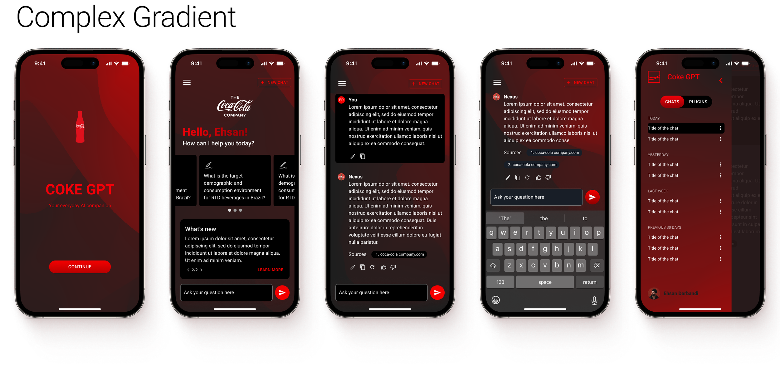
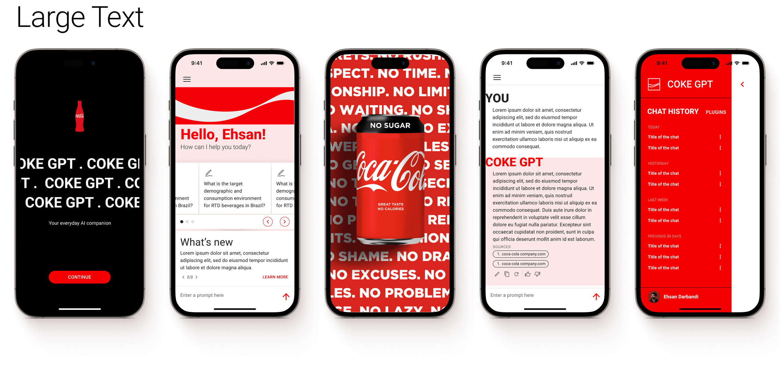
The initial brief asked for a "wow effect." I developed five visual directions. The complex ones were exciting — but when mapped against the engineering timeline and QA capacity, the answer was clear. I called a meeting with leadership and presented an effort-impact analysis across all five.


The pushback — and how I handled it
The design director's reaction was immediate: "This looks generic." My argument: "Impressive" is a feeling, not a design requirement. A polished, on-brand product that ships on time is worth more than an ambitious UI that ships broken or late. The effort-impact data made the case. He accepted the rationale — and the timeline held.
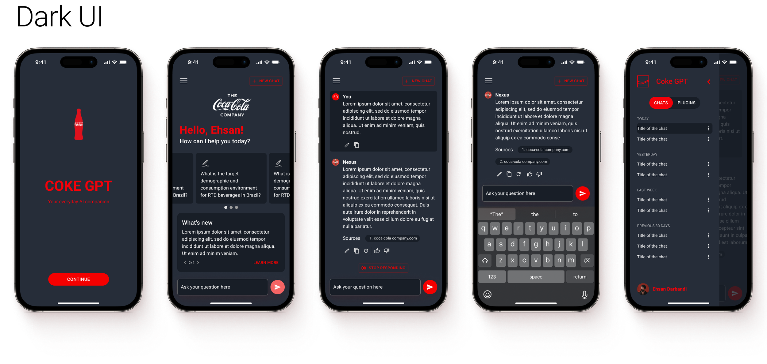
Design System & Visual Language
To ensure consistency and scalability, I built a lightweight design system tailored to Nexus AI. I started by auditing Coca-Cola’s existing brand assets and design language, then extended them into reusable components, patterns, and guidelines that aligned with both Coca-Cola’s identity and the needs of an AI interface. Since development resources were limited, I prioritized simplicity and modularity, making sure the system could be implemented quickly without sacrificing brand integrity. The result was a visual language that felt Coca-Cola unmistakably. Providing a foundation that the team could build on as the product evolved.

The Design
One interface, flexible enough for every department.
The core model mirrors what employees already knew — centered chat, clean thread, minimal chrome — with Coca-Cola's brand layer on top. Midway through the project, the finance PM requested a fully custom UI. I pushed back: familiar patterns matter more than differentiation for enterprise AI adoption. What finance needed wasn't a new interface — it was structured output formatting (tables, graphs, data responses) that the existing system already supported. They agreed. One coherent system served every department — and stayed extensible enough to be applied to two more AI tools after I
Outcome
From under 100 users to 500
in the test group alone.
Nexus AI entered pre-launch testing in the final weeks of my engagement. Active users grew from under 100 (previous tool) to approximately 500 — without a formal rollout. Test users and stakeholders consistently cited usability and branding as the reasons it felt different from the tool they'd abandoned.
5×
User growth before official launch
The previous tool peaked under 100 active users. The rebuild reached ~500 in pre-launch testing ahead of the company-wide rollout to 50,000+.
Reflection
What I'd do differently.
I'd Change
Get test group users in front of the visual directions earlier. User signal is harder to argue with than an effort-impact matrix — and it would have made the design director conversation shorter.
2+
Products built on the design system
The component library was handed off and immediately applied to at least two additional Coca-Cola AI tools, including marketing team extensions.
I'd Change
Document design rationale more formally throughout. The component library was solid at handoff, but the thinking lived in my head. A decision log reduces drift when others extend the system.
Most Proud Of
Navigating the tension between what leadership wanted (impressive) and what the project could support (minimal, polished, on-brand) — and making that case in a room where I was the only designer. The numbers validated the call.