
Tailorbird
Designing the human fallback for a computer-vision model — as the first designer at a proptech startup, six years before "AI product design" was a job title.

The bet
In 2020, a team of Wharton-trained contractors, developers, and AI researchers was trying to break something everyone in real estate accepted as fixed: to bid a renovation, you have to send a person to the building.
Their answer was a computer-vision model. It read the photos already sitting on Zillow and the MLS — flat, tilted, badly cropped listing photos — and extracted real measurements from them, accurate to within a 2% margin of error. Four provisional patents. What that unlocked commercially was sharp: a fixed-price renovation bid in under 24 hours, with no site visit, delivered during due diligence — before the investor had even closed on the building.
That moved 35–40% of a general contractor's work to before acquisition. For a PE fund buying a 200-unit property, it turned renovation cost from a line item you guess at into a number you can underwrite.
I joined as the first designer, three months out from a seed raise, responsible for the brand, the website, and the first version of the app.
Role
First designer, solo
Timeline
4 months
Deliverables
Brand, marketing site, app MVP
Team
Direct with Tim Cantwell (CEO), Gaurav Saraf (Computer Vision)

The problem nobody had designed for
The model was good. It was not complete. Listing photos don't cover every room. A half-bath behind a kitchen door doesn't get photographed. Angles are wrong, rooms are missing, and some properties have no usable listing at all. Every one of those gaps meant a bid the model couldn't produce — which meant the whole "no site visit" promise quietly fell back to sending a person.
So the product needed a second input stream. Not a replacement for the model — a fallback for it. Somewhere in the pipeline, next to "web images" and "floor plans," there had to be a lane called user images: photos captured on demand, by a human, of exactly the thing the model couldn't see.
That was the app. And it framed the design problem in a way that has aged unusually well:
How do you get a person with no technical literacy, no incentive, and no relationship with the company to capture the data a machine learning model needs precisely — without them understanding anything about the model?

Increase onboarding
Increase Efficiency
Build confidence in AI
Maintain brand integrity
Research
I interviewed six subject-matter experts — general contractors, real estate agents, and property owners — to map where the friction actually lived. The recurring blockers weren't technical:
Most interior data simply isn't online
Waiting for access to an occupied property
Measurement is slow and expensive
Travel to the location
Drawing an accurate floor plan
Knowing the current condition of the space
Almost all of these describe the same underlying thing: the building is occupied, and someone lives there.

Conversational: Excels at casual conversation and creative writing.
Versatility: Handles various tasks like code debugging and writing different content formats.
Limited Integration: Primarily a standalone web app, lacking integration with other tools.
Lacks source attribution: doesn't provide sources for its responses, hindering credibility for factual inquiries.

Accessibility: Straightforward interface with clear prompts and functionalities.
Search Integration: Seamlessly integrates with search engines for fact-checking and research.
Focus: Leans more towards information retrieval and completion than open-ended conversation.
Limited Creativity: May struggle with highly creative writing prompts compared to ChatGPT.

Deep Integration: Integrates directly with developer environments like Visual Studio Code, boosting workflow.
Inconsistent responsiveness: UI elements may disappear on smaller screens, creating a frustrating user experience.
Inconsistent Intuitive Interaction: Some interactions are not as intuitive as expected. Users may encounter unexpected behavior.
The user nobody was designing for
The customer was a PE investor. The operator was a general contractor. But neither of them was the person who had to succeed at the task.
User Persona 1
Megan was. Fifty years old, a registered nurse in San Francisco, single with two kids, intermediate tech proficiency. Her landlord asked her to let someone in to measure the apartment, because he wanted to renovate after she moved out. Her stated drivers were minimal communication with others, being as efficient as possible, and focusing on what's important in her life. She is the primary user. She has no stake in the renovation, no loyalty to the company, and every reason to give this five minutes and no more.
User Persona 2
Tim — thirty-six, a general contractor in Miami, high tech proficiency, who wants to bid more projects in less time and delegate everything else. He's motivated and capable. He was never the hard problem.
Designing for the reluctant, unincentivized human at the bottom of a B2B value chain is a different discipline than designing for a power user. Everything downstream followed from taking Megan seriously as the primary.


What we built, and what we cut
I ran design workshops at each stage to generate solutions, then prioritized them against viability and cost. The candidate feature list was long: real-time measurement, object identification, video recording, task editing, in-app communication with the operator, user profiles, tutorials, flexible flows.
Then we tested it. Four findings reshaped the product.
Two personas need two flows. Contractors and tenants have different motivations, capabilities, and goals. One flow serving both served neither.
The tenant flow was too complicated. Built for someone with minimum technical literacy, it wasn't. It needed to be rebuilt around that constraint, not adapted to it.
Sign-up was unnecessary. The operator already sends the tenant a unique link, and the tenant follows the instructions exactly once. An account was pure friction protecting nothing. We cut the entire authentication flow.
Each iteration removed steps that weren't critical to the outcome. Simplified information architecture. One clear command per screen. No repeated information. A clear hierarchy between titles and content. The goal was a single happy path that a nurse could complete, once, on the first try, without help.
Brand and story
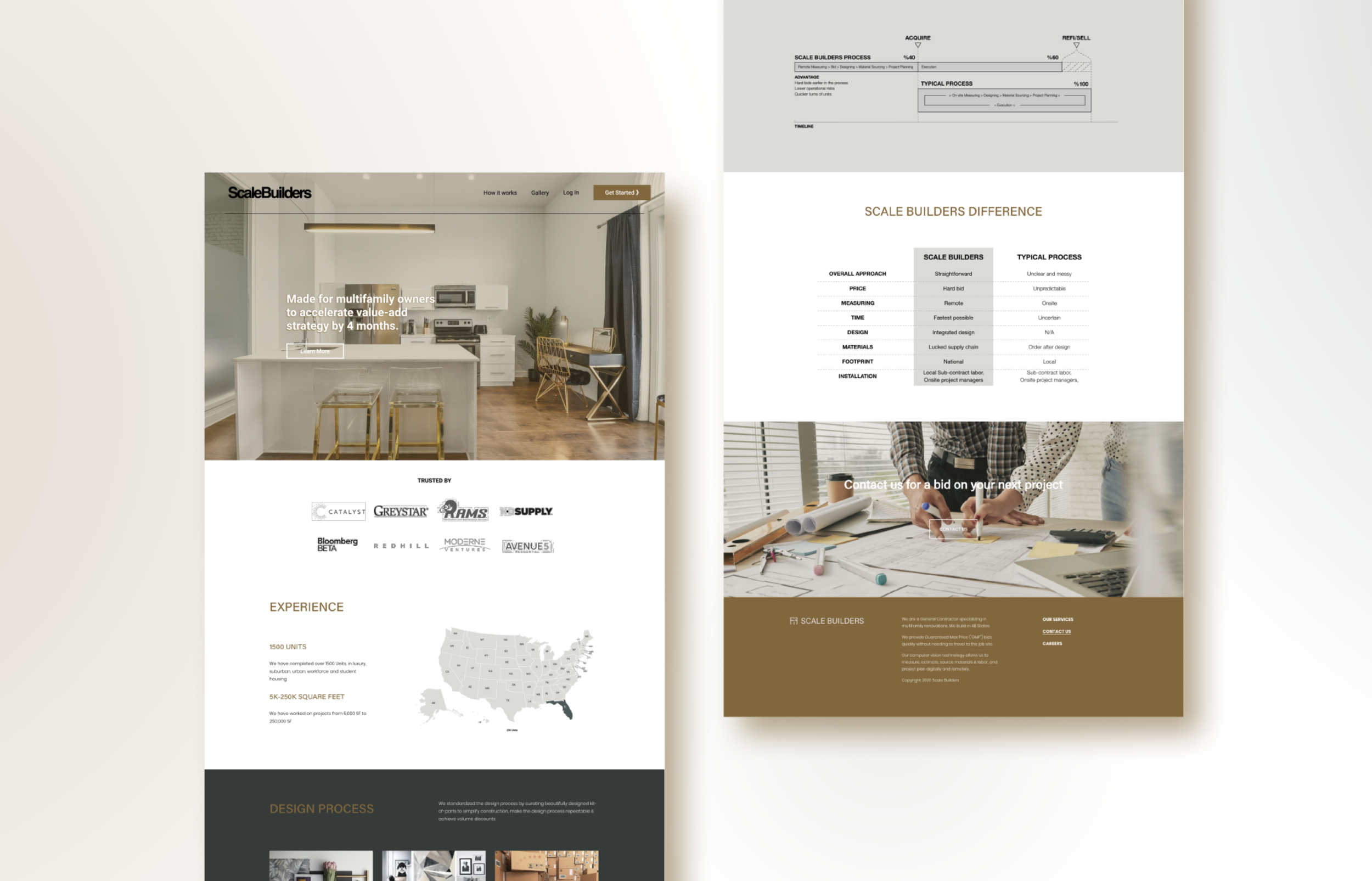
Alongside the app I designed the brand and the marketing website, and worked on the investment narrative itself. The company's site map named the audience explicitly — PE investors, REITs, local developers, large portfolio owners, national third-party managers — which kept the product honest: this was never a consumer app, it was a workflow demo for an institutional buyer.
Partway through, the company rebranded from Scale Builders to Tailorbird, and I was part of that transition — carrying the new identity through the deck, the site, and the product.
Brand and story
Alongside the app I designed the brand and the marketing website, and worked on the investment narrative itself. The company's site map named the audience explicitly — PE investors, REITs, local developers, large portfolio owners, national third-party managers — which kept the product honest: this was never a consumer app, it was a workflow demo for an institutional buyer.
Partway through, the company rebranded from Scale Builders to Tailorbird, and I was part of that transition — carrying the new identity through the deck, the site, and the product.
In-app communication was unnecessary. A clear interface and good instructions did the job that a chat feature was being asked to do — and chat carried real operational costs on the other end. Cut.
Outcome
The concept validated with investors and the company closed its seed round. The engineering team began building the first version of the app. The company expanded — adding a technical co-founder, software engineers, a real estate analyst, and an architectural designer.
Tailorbird today is a CapEx orchestration platform for institutional real estate: SOC 2 Type II certified, working with 28 of the NMHC Top 50 owners, over 1M units mapped and modeled, $2B+ in CapEx executed annually.
The product has moved well beyond what we built — architect-supervised modeling, a full portfolio platform. But the founding premise is the one this work was made to prove: owners will pay for verified interior data they can act on before it costs them money. My part of the story ended early, and I don't take credit for where the company is now. I'd point to it as evidence the bet was sound.
What I'd take from it
The interesting constraint wasn't the camera or the interface. It was that a machine learning model had a hole in it, and the only thing that could fill that hole was a person who didn't care about the model. Getting that person to produce clean, structured, model-ready input — through nothing but sequencing, instruction, and restraint — is the same problem I'd be solving today, with better tools and a name for it.