
AllAround
A location-aware wellness app that removes the friction between wanting to get outside and actually going
Sole Product Designer · UX Research, Interaction Design, UI · Concept → investor-ready prototype

The short version
AllAround set out to serve the people most fitness apps ignore: adults who want to move more but haven't started. I joined as the only designer and took the product from an unproven founder hypothesis to a validated, high-fidelity prototype. The defining design decision — leading the experience with evocative photography rather than maps — came directly from the research on why this audience doesn't act. The product tested well with its target users.
Role
Sole Product Designer — owned research through high-fidelity prototype
Scope
Research, strategy, IA, interaction design, UI, prototyping, usability testing
Users
Adults 20–45 who want to be more active but face motivational, social, or logistical barriers
Team
Two Founding member + me
THE OPPORTUNITY
The founders came to me with a hypothesis born from their own frustration: the fitness-app market is overbuilt for people who are already active and underbuilt for the much larger group who want to move more but don't know where to start. It's a real gap. My job wasn't to take their word for it — it was to test whether the gap was genuine and, if so, design something that actually closed it. That distinction shaped the whole engagement, including how I worked with the founders themselves.
THE PROBLEM
For most working adults, the barrier to activity isn't a lack of information — they already know they should move more. The barriers are motivational, social, and logistical: no time, no obvious place to go, no one to go with, and a quiet sense that fitness apps aren't built for "people like me."
DESIGN CHALLENGE
How might we shorten the distance between "I want to get outside" and "I know exactly where to go" — and keep people coming back long enough to build a habit?

RESEARCH
Research Goals
Before proposing any solution, I needed to deeply understand the users the founding team believed were underserved. My research focused on three questions:
What are the real emotional and logistical barriers that stop people from being more active?
What motivates people to go outside when they do?
Where do existing apps fall short for non-athletes?
User Interviews
I conducted 8 qualitative interviews with adults aged 22–44 across a range of occupations and activity levels — from sedentary desk workers to occasional weekend walkers. I recruited participants who identified as "wanting to be more active" but not currently maintaining any fitness routine.
Key themes that emerged
Social accountability is a primary motivator. Nearly all participants said they were significantly more likely to commit to outdoor plans if a friend was involved. Scheduling friction — not lack of interest — was the main blocker.
Motivation is episodic, not consistent. Users described feeling motivated after busy or stressful days, but had no accessible way to act on that impulse quickly.
Novelty drives action. Participants noted they were far more likely to go outside when there was a new place to explore — a route they hadn't seen, a park they'd been meaning to visit.
Professional athletes are in the wrong frame. Multiple interviewees said they'd tried fitness apps and felt they weren't "fit enough" to use them. The language, imagery, and metrics in existing apps assumed a level of commitment they hadn't reached yet.
Small wins matter. Several users mentioned feeling genuinely good after short, low-effort outings like dog walks or foot errands — but existing apps dismissed these as non-events.
Secondary research (CDC and behavioral-health studies) confirmed the same barrier set — perceived lack of time, low self-efficacy, no social support, boredom, cost. The convergence pointed to one strategy: accessibility, social connection, and progressive engagement — not performance tracking.
From research to a product principle
I synthesized the interviews into three personas grounded in real quotes and behavior — Marie (the time-poor professional), Satwik (the remote worker who never has a reason to leave the house), and Leah (the lapsed exerciser rebuilding a habit).
The Time-Poor Professional Full-time manager and dog owner. Wants to be more active but struggles to justify time away from work and family commitments. Would benefit from short, efficient activity options she could integrate into her existing routine (e.g., dog-friendly parks near the office).
The Remote Worker Seeking Structure UX researcher working from home. Spends 8+ hours daily at a screen with no natural reason to leave the house. Needs external prompts and interesting destinations to interrupt sedentary patterns. Highly motivated by discovery and novelty.
The Lapsed Exerciser Artist and parent. Was more active before having children and wants to rebuild a habit. Motivation is high, but consistency is the challenge. Would benefit from social features and visible progress to maintain momentum.
User Journey Mapping
But the personas weren't the turning point. The journey maps were. Mapping each persona from motivation trigger → discovery → planning → execution → reflection exposed exactly where people fell off: They had the motivation, but no immediate next step — and by the time they'd figured out where to go, the impulse was gone.
That gave me the principle that governed every decision afterward:
Collapse the distance between "I want to go outside" and "I know exactly where to go."

COMPETITIVE ANALYSIS
I audited four direct and indirect competitors: Komoot, AllTrails, Google Maps, and Strava.
Key finding: Every existing solution was built for a user who already knows what they want to do and needs help executing it. None addressed the earlier stage of the journey — the user who is motivated but undecided, or the user who doesn't identify as a "hiker" or "runner."

None served the earlier, harder moment: the person who's motivated but undecided, who doesn't identify as a "hiker" or a "runner." That was the opening, and it gave the founders a defensible position to take to investors: AllAround would own the entry-level outdoor-wellness market the incumbents had left wide open.
DEFING THE MVP
The research translated into a clear product strategy: personalized discovery, contextual prompts at receptive moments, frictionless social coordination, progress tracking that celebrates small wins, and effort-tagged suggestions so no one feels out of their depth. The harder work was deciding what not to build — and that's where I had to navigate the founding team.
The founders had come to AllAround the way many do: solving their own problem. That gave them conviction, but it also quietly narrowed the product to an audience of one. My research kept surfacing barriers they hadn't personally felt, so part of my role became widening the lens from "what we want" to "what the market needs."
The clearest case was in-app messaging. The founders wanted it in the MVP; I pushed back. It didn't solve a validated user barrier, it duplicated tools people already use, and it would have drained scarce early resources from the features that actually closed our drop-off points. We cut it — positioned as a post-MVP candidate rather than a flat no, which kept the founders aligned while protecting the MVP's focus.
To choose the rest, I generated sixteen concepts across motivation, discovery, and social coordination, then prioritized against a single question: does this feature close a drop-off point the journey map exposed? That test — not a generic impact/effort score — decided the MVP. Discovery and social coordination led, because those were the exact moments when motivated users fell off before acting.
MVP scope
location-aware discovery, personalized onboarding, in-app social planning, activity tracking, achievement sharing, and a smart notification system.
The defining decision: photos, not maps
The home screen was the highest-stakes interaction in the product, and it came down to a fork. The obvious pattern is a map. But a map serves someone who has already decided to go and needs to navigate. Our user hadn't decided yet. For them, a map is a chore: it asks for effort before they feel any pull.
So I led with route cards — large, evocative photographs of the place itself — and demoted the map to a secondary view. The tradeoff was deliberate: I traded away some at-a-glance spatial context (distance, precise location) for emotional pull. For a product whose entire job is motivation, not navigation, that was the right trade.
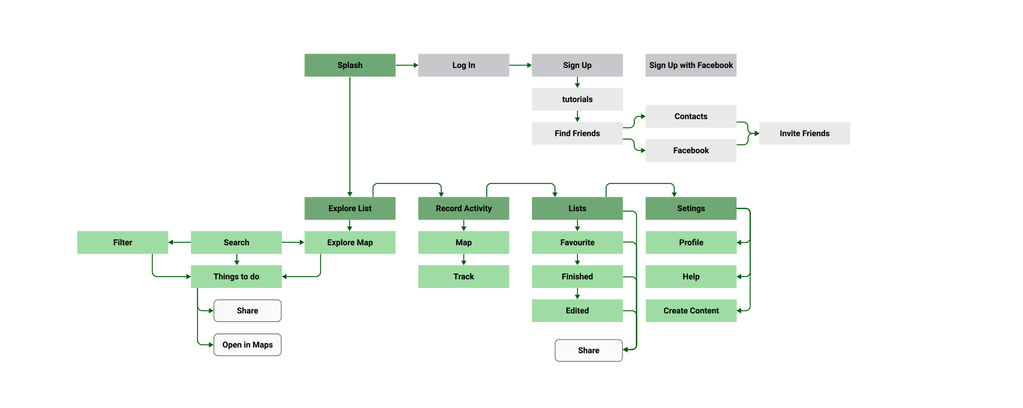
I built the information architecture around the same principle: the path from "I want to go outside" to "I know where to go" had to take under 30 seconds. That meant surfacing personalized suggestions immediately on the home screen and treating filtering as an opt-in refinement — never a required first step.
TESTING AS A DECISION TOOL
I tested twice, deliberately at different fidelities, to de-risk the structure before investing in visual design.
When I tested the high-fidelity prototype, the image-led suggestions were the highest-rated element of the experience — direct validation that the bet on emotional pull over utility was the right one.
Lo-Fidelity Prototyping
Testing the core flows before any pixels surfaced three structural problems, each resolved as a design decision rather than a patch:
Filter friction — users had to reapply filters on every visit to the Explore tab. → I surfaced their preferred activity types by default; filtering became opt-in.
Ambiguous "Favorites" — a nav-bar Favorites icon was consistently misread. → I moved saving into contextual actions on the activity cards and removed it from primary navigation.
Over-structured trip editing — the flow assumed people plan ahead; testing showed they're spontaneous. → I redesigned editing around in-the-moment adjustments, not pre-trip configuration.

UI Design
The visual design direction was informed by the brand positioning: approachable, active, and grounded in the natural world. The palette draws from outdoor environments — deep forest greens, warm amber, and clean neutrals — deliberately avoiding the neon-and-black aesthetic of performance fitness apps.
Typography choices prioritised legibility during activity (larger touch targets, high-contrast text) while maintaining a design language that felt premium enough to justify a subscription model.

High-fidelity Prototyping
Finding and saving a nearby activity: 87.5% completed unassisted (7/8)
Planning an activity with a friend: 75% completed (2 needed a prompt on the invite flow)
Average perceived ease of use: 4.2 / 5
Highest-rated element: the personalized, image-led activity suggestions
Most-requested addition: more activity types (outdoor yoga, group classes, surfing)

OUTCOMES & REFLECTIONS
What the prototype validated
The engagement produced what it was scoped to produce: a validated, high-fidelity prototype that tested well with its target users and gave the founders a concrete artifact to pitch. Notably, the non-athlete users we'd designed for cited discovery and social connection — not performance and metrics — as the reason they'd choose AllAround, with 6 of 8 test participants naming social coordination as their primary draw.
The company didn't ultimately raise. We pitched, but couldn't build enough investor conviction that the market was large and reachable enough to back, and the team eventually moved on.
I'll be straight about that, because the lesson in it is the most valuable thing I took from the project. We had validated desirability and usability — people liked the product and could use it. We had never validated viability: willingness to pay, cost of acquisition, the real size of the reachable market. Those are the questions investors fund against, and design alone can't answer them. If I ran this again, I'd run a business-model and demand test alongside the usability tests from week one — de-risking the business, not just the experience.
What I would do differently
Validate the market alongside the experience.
The biggest gap wasn't design quality; it was proving people wanted AllAround without proving there was a fundable business around it. I'd define and test business metrics — day-7 and day-30 retention, free-to-paid conversion — from the start.
Push harder on notifications.
Smart, contextual prompts were a core value proposition but the least-developed part of the prototype. They're likely the highest-leverage mechanism for habit formation, and they deserve their own design-and-testing cycle.
Pressure-test the social graph earlier.
The friend-planning feature assumes users arrive with friends to invite. I'd explore network-effect mechanics — discovering nearby users, joining open group activities — so the social value holds for people who join without a network.

PROTOTYPE
